Viva Magenta! Pantone’s Color of the Year 2023 Celebrates Bravery and Fearlessness

We live in a highly visual world. Wherein a picture is no longer just a picture. With the savviness of technology, a whole story can be said with just an image. With the savviness of technology, an image can tell the entire story. You can play with the elements, application of colors, and use graphics and text to convey a powerful message to your audience.

Color is a powerful communication tool. It has abstract and sublime details that are not easy to describe. It is an element of visual language that people process before being consciously aware they have seen it. Humans tend to focus on objects with higher contrast compared to their environment. Our eyes automatically focus on the brightest object. Why do you think road signs are either bright red or yellow? This proves that if you play well with colors, it catches your attention.
Various brands have capitalized on this effect. Colors increase brand awareness by 80%. Big brands like Coca-Cola are always associated with the red color. Home Depot has its signature orange color. Who can miss the yellow-golden arches of McDonald’s? Color is key in the overall design of a brand’s logo. Because color affects how a brand is perceived. Colors alone can influence an initial impression up to 90%, and 85% of shoppers’ purchase decisions depend on color. Customers will rely on these impressions to choose which brand or company they purchase from.
Research has been done on using colors and their effect on our perception and behavior. We can go back to primitive times when early humans relied on color to differentiate which plants were edible or not. In recent times, color has been prevalent in every aspect of our lives. But more so in visual media.
As a graphic designer, you must have a very intimate knowledge of colors because color has a language. It has definitions and nuances that can communicate visual and psychological messages. Learning the psychology of colors is one of the best graphic design tips to master.

The Psychology of Colors
Colors have qualities that can cause certain emotions in people. These emotions then move you to action. In color psychology, certain colors affect people’s behavior, mood, and stress levels.
You can associate the red color with passion and rage. It is also for movement and excitement. is best used in promotions or sales. Red is also widely used in the food industry since it stimulates appetites.
Blue, on the other hand, defines tranquility. It is peaceful and secure. If you want to build trust, this is the color you’d want.
The last of the primary colors are yellow. It is the most eye-catching. It evokes happiness and overall positive emotions.
Although the examples mentioned earlier are universal, we must remember that emotional association with colors is rooted in cultural upbringing. In English, you have the term “ green with envy.” But in German, you use the term yellow (gelb vor Neid Sein). The color red is lucky in China but unlucky in Nigeria. Black is a symbol of bad luck in most countries. But it is a sign of maturity, masculinity, and age in Africa.
So, you have to be careful in using colors in your design. You have to be mindful that not all colors speak the same language.
Colors also undergo trends. Designers use some colors more than others. Knowing and familiarizing yourself with various color trends enables you, as significantly most, to have an advantage over other designers. You can offer your clients original ideas that could help their brands.
The Pantone Color System or PMS is a standardized color matching popular worldwide. Artists use this in graphic design, fashion design, product design, printing, and manufacturing. They offer a simple process wherein different industries use standardized color matching to classify, communicate and match colors using a catalog. In 1999, they released the “Color for the Year”.
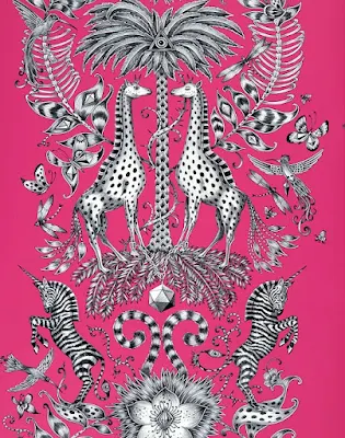
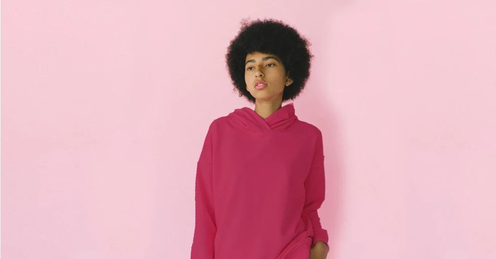
For 2023, the Pantone color of the year is Viva Magenta.

Viva Magenta is the Color of the Year 2023
Pantone explains that they created the Pantone Color of the Year to engage the design community and color enthusiasts worldwide in a conversation around colors. They wanted to draw attention to the relationship between culture and color.
Who decides the Pantone color of the year? The Pantone Color Institute has a global team of color experts traveling worldwide looking for color influences. They take influences from various aspects of society, like film, music, television, art, fashion, politics, and social media. There are also influences from new technologies, social-economic situations, travel destinations, various lifestyles, and escapes.
In simpler terms, the color chosen for the next year is under everything and anything that happened that significantly affected culture during the current year.
The selection process, according to Pantone, is a year-long decision process. The various members of the Pantone Color Institute would discuss different color trends. Each of them is a member of various fields, and each would be partial to a certain color. But, in the end, they will come together and form a consensus on which color is best.
Pantone emphasizes the color they choose crosses all areas of design. It is a color that serves as an expression of a mood and an attitude of consumers. The color will resonate worldwide, reflect what people are looking for and answer what they feel they need.
There is also an emotional aspect behind the decision-making. The colors need to reflect what is happening in the global culture at a specific moment. The popularity of color is symbolic of the age we live in. So each color sort of creates its own identity and its backstory. It’s used as a marker, reflecting events from certain times in history.
For 2023, Viva Magenta was chosen as Pantone color of the year.

The Meaning Behind Viva Magenta
For a more precise color identifier, it’s Viva Magenta 18 -1750. By using the color code in the Pantone Matching System, you’ll get the exact color you need. Keep in mind that suffixes like TPX or TC will appear. TPX means that the reference color on the swatch was printed on paper. TC on the other hand is a dyed cotton reference. An eco-friendly formulation is identified with TPG as a suffix.
Viva Magenta is the color of optimism. Coming from the red family, it's a color for strength and vigor. It is brave and fearless.
And after suffering for years from the pandemic and looming recession, we could use color to give encouragement and bolster us as we face the uncertainties of 2023.
Leatrice Eiseman, the executive director of Pantone Color, says, “It is inspired by the red of cochineal, one of the most precious dyes belonging to the natural dye family as well as one of the strongest and brightest the world has known.”
It is a color of universal harmony and emotional balance. It is very striking to see but simultaneously shows subtle hints of comfort. It encourages reaching for the stars but having your feet rooted to the ground. Magenta wants you to have balance in your life, both spiritually and physically.
The color pushes us to move. It encourages experimentation and exploration without restraint. Viva Magenta is the color of the rebellious spirit. After being cooped-up up during the lockdowns, this is the time for you to stretch out and go out.
It is a hybrid color that represents the duality of existence by straddling physical and virtual realities. It explores the dynamics of artificial intelligence and human creativity. In Art Basel Miami, it was revealed that the color was used with AI art generator Midjourney to create “ The Magentaverse”.
Viva Magenta represents freedom after being restrained. for a long time. It is a color of action. As you move forward to a more positive future, it is an aggressive stance.

How Will This Color Impact Graphic Design in 2023
Imogen Hills, senior art director of 99designs.com, says that she can already see designers using this color. She says, The rebellious spirit of Viva Magenta aligns with the design trends we see for 2023, such as Punk Revival. People are feeling empowered to rail against failing systems in the search for something new and fresh
This anti-establishment, dark, and very chaotic design trend works well with the vibrancy of magenta, It creates deep contrast if used in either the foreground or background. It can be used as highlights to give focus to your story. Punk revival is all about anarchy. As with the magenta, it is a leap towards non-conformity and unabashed self-expression.
Bold colors like magenta are best associated with femininity and romance. So brand marketing of products designed for women will fully embrace this color. Logos, web design, and merchandise will predominantly use this color to attract the attention of its female target audience.
Magenta is also popular with creative and artistic crowds. The color is one-of-a-kind. It is also non-conformist and eye-catching. It doesn’t just grab your attention but stuns you into looking at it. Artists and designers love the effect it brings to their work.
What Colors Match Well with Magenta
Colors communicate messages without words. Magenta clearly defines itself. The color could be overbearing if not correctly used. The message you're trying to convey might get lost amidst its vibrancy.
You must remember that magenta has its traits and characters. If you use it, it must fit the message you are trying to convey. Using other colors to compliment magenta will create a cohesive image. The colors would work together to produce an exceptional graphic design. Your color palette must be effective; that is one of many graphic design tips to remember.
Here are some trending colors that work well with magenta.
1. YELLOW

We start with complimentary colors that lie opposite one another in the color wheel.
Yellow compliments magenta as both are very vibrant and eye-catching. They are both colors that depict joy, liveliness, and optimism. It is also a powerful color, so use it sparingly. The color can also be childish. Make sure that the use of color is appropriate for your project.
2. GREEN

The color also takes from nature, like magenta. Green could be used to balance the vibrating pulse of magenta with the serene and calming presence of green. It is the most versatile color as it appears everywhere. You go out and see the trees, plants, and grass.
You can also play around with different hues and intensities. Lighter shades are relaxing, and darker shades are energetic.
Midtone greens are one of the trending colors for interior designs this year.
3. PURPLE

Purple is all about elegance. Always associated with royalty, if partnered with magenta, that is truly an image of luxury.
4. BLACK

Black has always been popular in graphic design, especially web design. It makes any color pop out of your screen if used as a background.
Paired with magenta, it adds sophistication. It tames the chaotic magenta by adding a serious tone.
5. GREY

The color is always used as a secondary color as it is neutral. Also very popular in web design. As a background, it doesn’t evoke strong emotions compared to other colors. It is also not as powerful as black but carries the same somber elegance and luxurious feel.
There are numerous other colors that you can pair with magenta. Some will clash since magenta is such a powerful color. Some colors work well as a background for magenta. You can use a background remover like Remove bg to easily edit your backgrounds and incorporate these colors in your work or project.

Conclusion
Pantone once said they did not create “Color of the Year” so that everyone in the industry would follow the trend and use the color exclusively. It is not to direct the artists and designers to limit themselves by using color in their work. And it is not to drive up sales for the company.
They want industry players, makers, and even ordinary people to know about the power of color.
We may differ in gender, culture, age, and background, but the psychology of colors still applies to everyone. We are affected by colors on an emotional level that is powerful and moves us into action.
Pantone color of the year Viva Magenta, celebrates our reawakening. We are no longer wallowing in despair amidst the wreckage of the pandemic. We are pushing forward with exuberance and optimism that the future will be much better than we had.
As graphic designers, we embrace magenta to encourage us. Apply the color to your image. Use the color’s personality to bring about your message.
